Getting Started
Installation
To use report_creator, first install it using pip:
Install
To install the package, run:
$ python -m pip install report_creator -U
Quick Start
import plotly.express as px
import report_creator as rc

with rc.ReportCreator(
   title="My Report",
   description="My Report Description",
   footer="My Report Footer",
   logo="octocat",
) as report:

   view = rc.Block(
      rc.Markdown("""It was the best of times, it was the worst of times...""",
      label="Charles Dickens, A Tale of Two Cities"),
      rc.Group(
            rc.Metric(
               heading="Answer to Life, The Universe, and Everything",
               value="42",
            ),
            rc.Metric(
               heading="Author",
               value="Douglas Adams",
            ),
      ),
      rc.Bar(px.data.medals_long(),
               x="nation",
               y="count",
               dimension="medal",
               label="Bar Chart - Olympic Medals",
      ),
      rc.Scatter(
            px.data.iris(),
            x="sepal_width",
            y="sepal_length",
            dimension="species",
            marginal="histogram",
            label="Scatter Plot - Iris",
      ),
   )

   report.save(view, "report.html")
ReportCreator Configuration
The rc.ReportCreator() context manager accepts several parameters to customise the report:
Parameter |
Description |
|---|---|
|
Report title shown in the header. |
|
Subtitle below the title. Supports Markdown. |
|
Footer text. Supports Markdown and emoji shortcodes (e.g. |
|
See Logo section below. |
|
A CSS color name or hex string used as the report’s accent color (e.g. |
|
Highlight.js theme for code blocks (e.g. |
|
Mermaid.js theme for diagrams: |
The report.save() method accepts:
report.save(view, "output.html", prettify_html=False)
Set prettify_html=False (the default) for faster saves on large reports.
Logo
The logo parameter is optional. To include a logo, pass:
A file path to a local image
A URL to a remote image
A base64-encoded image string
A GitHub handle — the organisation’s GitHub avatar is fetched automatically (e.g.
logo="apple")
If no logo is provided, an SVG-based logo is auto-generated from the report title.
Layout
There are two container components for arranging content:
rc.Block(*components)— stacks children verticallyrc.Group(*components)— arranges children horizontally
Every component accepts a label parameter that is styled appropriately. Labels support Markdown.
rc.Block(
    rc.Heading("Overview", level=2),
    rc.Group(
        rc.Metric(heading="Users", value="10,412"),
        rc.Metric(heading="Revenue", value="$1.2M"),
        label="Key Metrics",
    ),
)
Use rc.Separator() to insert a horizontal rule between sections.
Tabs
rc.Select() renders its children as tabs. Pass a list of components via the blocks parameter.
Each component’s label becomes the tab title, so every block passed to rc.Select() must have a label.
rc.Select(
    blocks=[
        rc.Bar(px.data.medals_long(), x="nation", y="count",
               dimension="medal", label="Bar Chart"),
        rc.DataTable(px.data.iris(), label="Raw Data", index=False),
    ],
    label="Results",
)
Note
rc.Select() renders as an interactive tab widget and is not print-friendly. For printed
reports, prefer rc.Block() with rc.Heading() sections instead.

Collapsible Content
Two components let you hide content behind a toggle:
rc.Collapse() — a single collapsible section.
rc.Collapse(
    rc.Python(source_code, label="app.py"),
    label="Show source code",
)
rc.Accordion() — multiple collapsible panels from a list of blocks. Each block’s label
becomes the panel heading.
rc.Accordion(
    blocks=[
        rc.Markdown("> To be, or not to be...", label="Hamlet"),
        rc.Markdown("> But soft, what light...", label="Romeo and Juliet"),
        rc.Markdown("> All the world's a stage...", label="As You Like It"),
    ],
    label="Shakespeare Quotes",
)
Formatted Text
There are several text components:
rc.Markdown()— preferred. Renders GitHub Flavored Markdown (GFM) with tables, emoji shortcodes, and LaTeX math.rc.Text()— plain prose text (deprecated; userc.Markdown()).rc.Html()— raw HTML embedded directly into the report.rc.Unformatted()— preformatted, monospace text preserving all whitespace (useful for ASCII art or log output).
Most components also accept a label which may contain Markdown.
rc.Markdown("""
## Results

| Model   | Accuracy | F1    |
|---------|----------|-------|
| Llama3  | 0.92     | 0.91  |
| GPT-4   | 0.95     | 0.94  |

Math: $E = mc^2$ :rocket:
""", label="Benchmark Results")

rc.Unformatted(r"""
 ___________
< Hello cow >
 -----------
       \   ^__^
        \  (oo)\_______
           (__)\       )\/\\
""", label="ASCII Art")
Callouts / Admonitions
Callouts (also known as admonitions) highlight important information, warnings, or errors.
rc.Info(text)— displays a general information block.rc.Warning(text)— alerts the user to potential issues or considerations.rc.Error(text)— highlights critical problems or failures.rc.Callout(text, title, color)— a customizable block where you can set the title and accent colour.
rc.Info("Please note that this process may take a few minutes to complete.")

rc.Warning("This API endpoint will be deprecated in the next major version.")

rc.Error("Failed to connect to the database. Check your credentials.")

rc.Callout("Custom configuration applied successfully.", title="Success", color="green")
Code
Language-specific components automatically apply syntax highlighting:
Component |
Notes |
|---|---|
|
Python source code |
|
SQL — also applies heuristic formatting |
|
JSON — pretty-prints the structure |
|
YAML configuration |
|
Java source code |
|
Shell scripts (aliases) |
|
Prolog source code |
|
Styled as code but no syntax highlighting |
|
Generic component — pass any Highlight.js language name |
The code theme is set via code_theme in rc.ReportCreator().
rc.Sql("""
SELECT
    ename,
    DECODE(deptno, 10, 'Accounting', 20, 'Research') AS dept
FROM scott.emp;
""", label="Employee Query")

# Generic component for less common languages
rc.Code("# comment\nval x = 42", language="scala", label="Scala snippet")
Example showing Prolog:

Notebook Compatibility
rc.Widget() accepts any Python object that implements _repr_html_(). This covers
Matplotlib figures, Plotly figures, Folium maps, Altair charts, and any Jupyter-compatible object.
import matplotlib.pyplot as plt
import plotly.express as px

# Matplotlib figure
fig, ax = plt.subplots()
ax.plot([1, 2, 3], [4, 1, 3])
rc.Widget(fig, label="Matplotlib Line Chart")

# Plotly figure (graph_objects or express)
rc.Widget(
    px.line(px.data.stocks(), x="date", y=["GOOG", "AAPL"]),
    label="Stock Prices",
)
Images
One of the goals of Report Creator is to produce self-contained output. The rc.Image() component
supports local paths, URLs, and base64 strings. Pass convert_to_base64=True to embed remote
images at report-creation time — this avoids CORS issues and ensures the image is available offline.
Use link_to to make the image a clickable hyperlink.
rc.Image(
    "https://example.com/chart.png",
    label="Monthly Sales",
    convert_to_base64=True,         # embed image inline
    link_to="https://dashboard.example.com",  # click to navigate
)
Gallery
The rc.Gallery() component renders a list of images as a clean, responsive grid of thumbnails. Clicking any thumbnail expands it into a full-screen Lightbox overlay, enabling users to browse the images interactively.
Like rc.Image(), it accepts a mix of local file paths, URLs, and base64 encoded strings.
rc.Gallery(
    images=[
        "https://example.com/photo1.jpg",
        "https://example.com/photo2.jpg",
        "https://example.com/photo3.jpg",
    ],
    labels=["Mountain View", "River", "Forest"],
    label="Nature Photography",
)
Charts
All chart components wrap Plotly Express and accept a Pandas DataFrame as the first argument.
The label parameter becomes the chart title.
Component |
Notes |
|---|---|
|
Bar chart. Use |
|
Line chart. Pass multiple column names to |
|
Scatter plot. Supports |
|
Histogram. Use |
|
Box plot. Use |
|
Pie/donut chart. |
|
Radar/spider chart. DataFrame rows are series; columns are axes. |
|
Gantt-style chart. See Timeline section below. |
|
Circular gauge indicator. |
|
Horizontal bullet chart for target comparison. |
rc.Histogram(
    px.data.tips(),
    x="total_bill",
    dimension="sex",
    label="Total Bill Distribution by Sex",
)

rc.Scatter(
    px.data.iris(),
    x="sepal_width",
    y="sepal_length",
    dimension="species",
    marginal="box",                  # adds marginal box plots on axes
    label="Iris Measurements",
)

rc.Line(
    px.data.stocks(),
    x="date",
    y=["GOOG", "AAPL", "NFLX", "MSFT"],
    label="Stock Prices",
)

rc.Radar(
    df=pd.DataFrame({
        "ModelA": {"Accuracy": 0.92, "Speed": 0.88, "Memory": 0.70},
        "ModelB": {"Accuracy": 0.87, "Speed": 0.95, "Memory": 0.85},
    }).T,
    lock_minimum_to_zero=True,
    filled=False,
    label="Model Comparison",
)

Timeline
rc.Timeline() renders a Gantt-style chart for project planning and scheduling. It takes a
Pandas DataFrame with task names and datetime start/finish columns. An optional dimension
column colour-codes the bars by category (e.g. team or phase).
import pandas as pd

rc.Timeline(
   pd.DataFrame({
      "task":   ["Design", "Development", "Testing", "Deploy"],
      "start":  pd.to_datetime(["2024-01-01", "2024-01-15", "2024-02-01", "2024-02-15"]),
      "finish": pd.to_datetime(["2024-01-14", "2024-01-31", "2024-02-14", "2024-02-28"]),
      "team":   ["Engineering", "Engineering", "QA", "DevOps"],
   }),
   task="task",
   start="start",
   finish="finish",
   dimension="team",
   label="Q1 Project Plan",
)
Gauge and Bullet Charts
rc.Gauge() and rc.Bullet() render as standalone indicator charts. They can also be embedded
directly inside rc.Metric() to provide visual context for a KPI value.
Standalone:
rc.Gauge(
    value=72.5,
    min_value=0,
    max_value=100,
    title="CPU Utilization",
    unit="%",
)

rc.Bullet(
    value=850_000,
    target=1_000_000,
    max_value=1_200_000,
    title="Quarterly Sales",
    unit=" USD",
)
Embedded in Metric:
Pass a gauge or bullet dict to rc.Metric() to attach a chart beneath the value.
The optional color key sets the fill colour.
rc.Metric(
    heading="System Load",
    value=72.5,
    unit="%",
    gauge={"min_value": 0, "max_value": 100, "color": "red"},
)

rc.Metric(
    heading="Q1 Sales",
    value=850_000,
    unit=" USD",
    label="Sales vs target",
    bullet={"target": 1_000_000, "max_value": 1_200_000, "color": "#ffb617"},
)
Tables
There are two table components:
rc.Table()— simple, static HTML table. Best for small datasets.rc.DataTable()— rich interactive table with pagination, search, column sorting, and export to PDF/print.
Both accept a Pandas DataFrame (or any table-like object). Use precision in rc.DataTable()
to control decimal places, and index=False to hide the DataFrame index.
rc.Table(df, label="Simple Table")

rc.DataTable(df, label="Interactive Table", index=False, precision=2)
Metrics
rc.Metric() displays a single KPI with a heading, value, and optional unit and label.
The layout engine ensures that coloured metrics never place the same colour adjacent to each other,
and that background/foreground contrast is always legible.
rc.MetricGroup() generates one rc.Metric() per row of a DataFrame — convenient when your
data is already tabular.
rc.EventMetric() analyses time-series data and plots event frequency over time. Pass a DataFrame
with a date column, an optional filter condition (a Pandas query string), and a frequency
(any Pandas offset alias
such as "D" for daily or "B" for business days).
# Single KPI
rc.Metric(
    heading="Chances of Rain",
    value="84",
    unit="%",
    label="24-hour forecast",
)

# Multiple KPIs from a DataFrame
rc.MetricGroup(
    df,
    heading="Name",   # column to use as metric heading
    value="Score",    # column to use as metric value
    label="Team Scores",
)

# Time-series event frequency
rc.EventMetric(
    df,
    date="timestamp",              # column containing datetime values
    condition="status == 200",     # Pandas query string (optional)
    frequency="B",                 # "B"=business days, "D"=daily, "W"=weekly
    heading="Successful Requests",
    color="green",
)

Diagrams
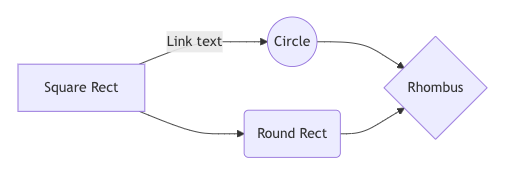
rc.Diagram() renders diagrams written in Mermaid JS syntax syntax — flowcharts, sequence
diagrams, Gantt charts, mind maps, and more.
Set pan_and_zoom=True to enable interactive pan/zoom on large diagrams.
rc.Diagram("""
graph LR
    A[Square Rect] -- Link text --> B((Circle))
    A --> C(Round Rect)
    B --> D{Rhombus}
    C --> D
""")

rc.Diagram("""
mindmap
  root((AI))
    Machine Learning
      Supervised
      Unsupervised
    Neural Networks
      CNN
      RNN
""", pan_and_zoom=True, label="AI Mind Map")
For simpler flowcharts, you can use the rc.Workflow() component instead of raw Mermaid syntax. It takes a list of strings for linear flows, or tuples for branching flows.
rc.Workflow(["Start", "Process", "End"], label="Linear Flow")

rc.Workflow([
    "Start",
    ("Start", "Process A"),
    ("Start", "Process B"),
    ("Process A", "End"),
    ("Process B", "End")
], circles=["Start", "End"], direction="TB", label="Branching Flow")
Miscellaneous
rc.Separator()— inserts a horizontal rule.rc.Heading(text, level)— section heading (level1–6, like HTML<h1>–<h6>).rc.Html(html_string)— embed arbitrary HTML (SVG, custom widgets, etc.).
Deck (Slide Presentation)
The rc.Deck() component allows you to turn your reports into interactive slide presentations. It
takes multiple rc.Block() or rc.Slide() components as arguments, where each block acts as a
single slide. If you wrap a Block in a Slide then you can apply a theme to the slide, otherwise it
will inherit the report’s default styling. The deck renders as a full-screen presentation with smooth
transitions between slides. The rc.Slide() component accepts a theme parameter to apply
pre-defined styles to individual slides. Examples themes are: a solid color (e.g., “#ff0000”,
“blue”)or a pattern with a color (e.g., “pattern:color”). Supported patterns are:
“circles”
“blocks”
“dots”
“stripes”
“mondrian”
“retro”
“modern”
An example of a slide with a pattern background (teal mondrian theme) would be:
rc.Slide(..., theme="mondrian:#14b8a6")
or a simple solid color background (purple) would be:
rc.Slide(..., theme="#800080")
Users can navigate between slides using a floating toolbar at the bottom, or by using their left and right arrow keys. All charts within the deck will automatically resize properly when brought into view. Touch navigation is also supported on mobile devices using the swipe gesture.
import plotly.express as px
import report_creator as rc

fig = px.scatter(x=[1, 2, 3], y=[3, 1, 6])

rc.Deck(
    rc.Slide(
        rc.Block(
            rc.Heading("Slide 1"),
            rc.Text("This is the first slide. Use the arrow keys to advance.")
        ),
        theme="mondrian:#14b8a6"  # teal background with mondrian pattern
    ),
    rc.Slide(
        rc.Block(
            rc.Heading("Slide 2"),
            rc.Widget(fig)
        ),
        theme="#800080"  # solid purple background
    )
)
Example showing Slide Deck:
